EAT
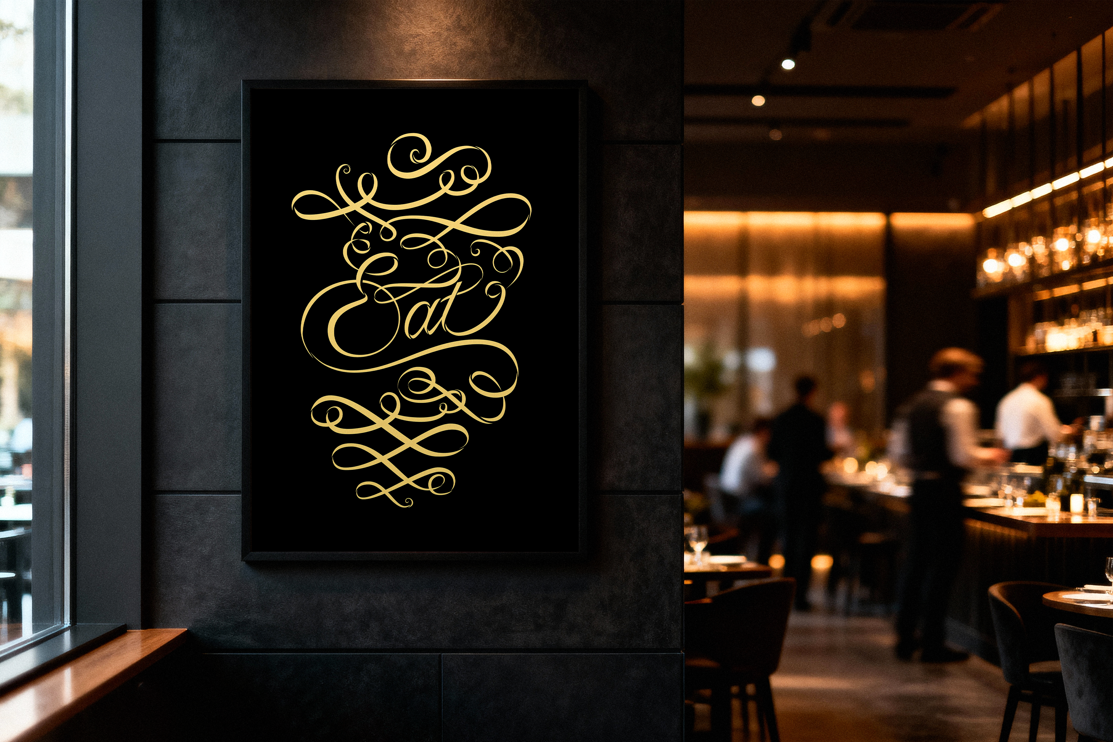
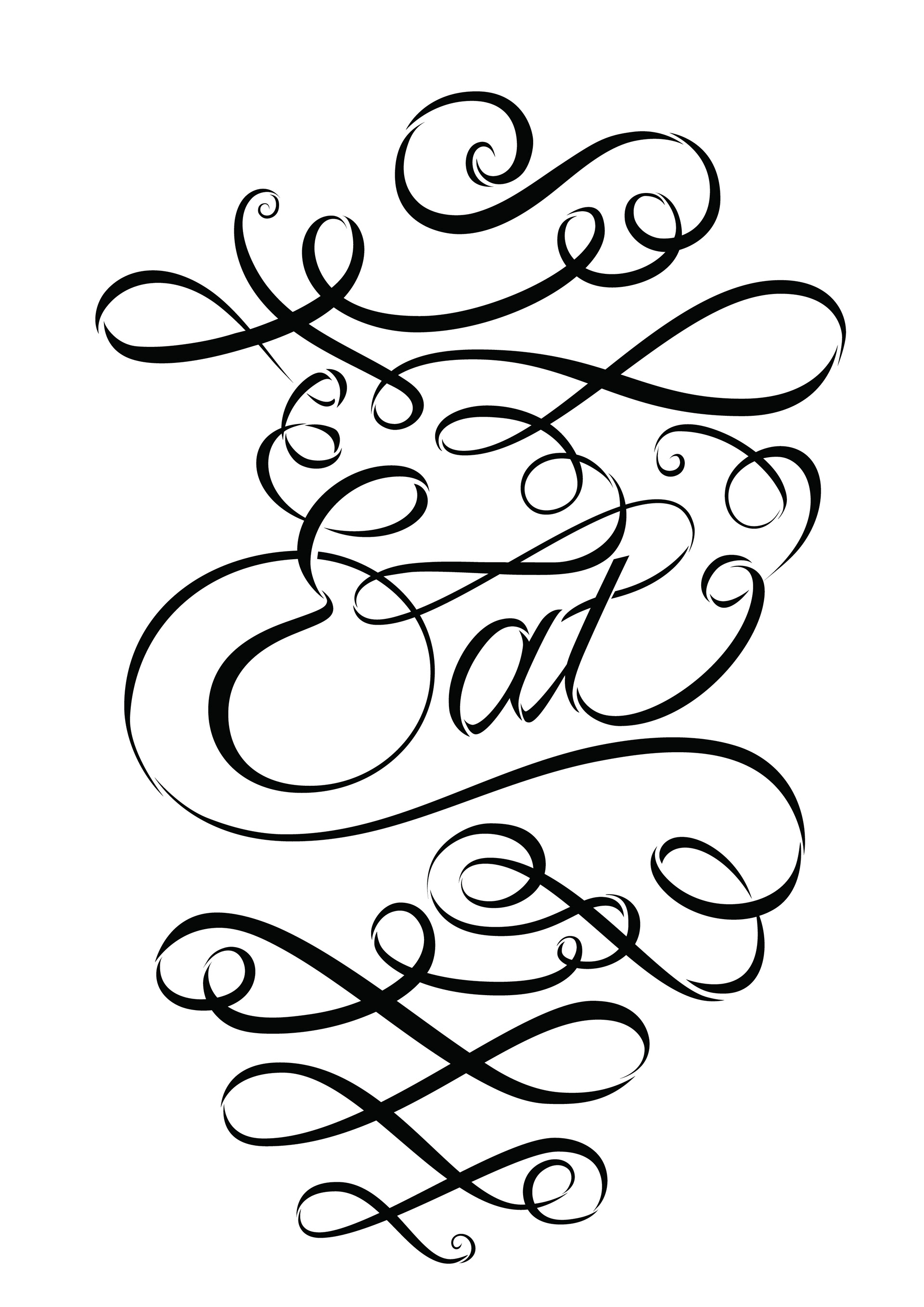
A typographic lettering poster for a restaurant. The composition illustrates the dynamic experience of sharing a meal. It illuminates the interactions between people, food, and communal gathering through rhythmic movement. A dining experience goes beyond what’s on the plate.
PROCESS
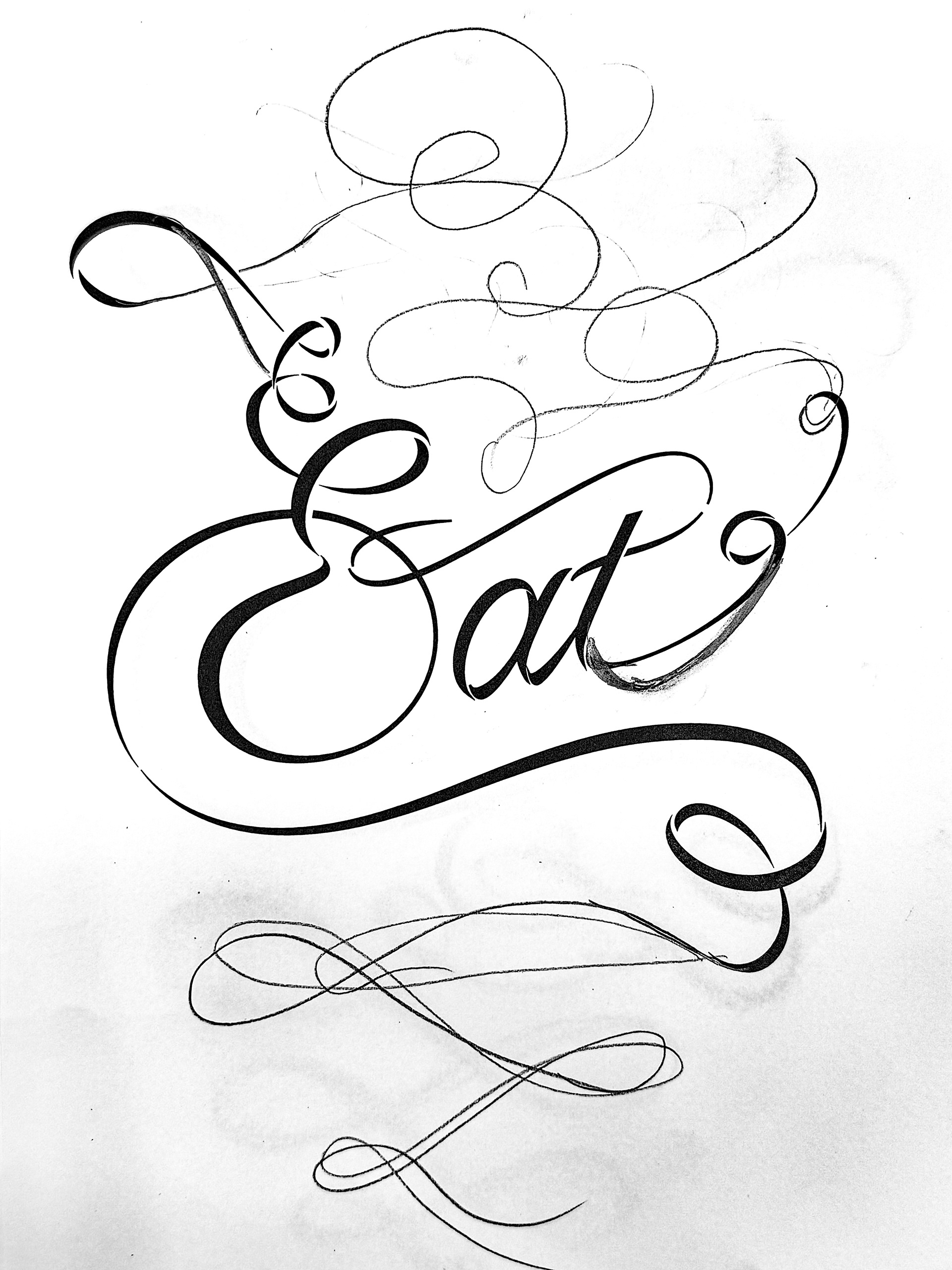
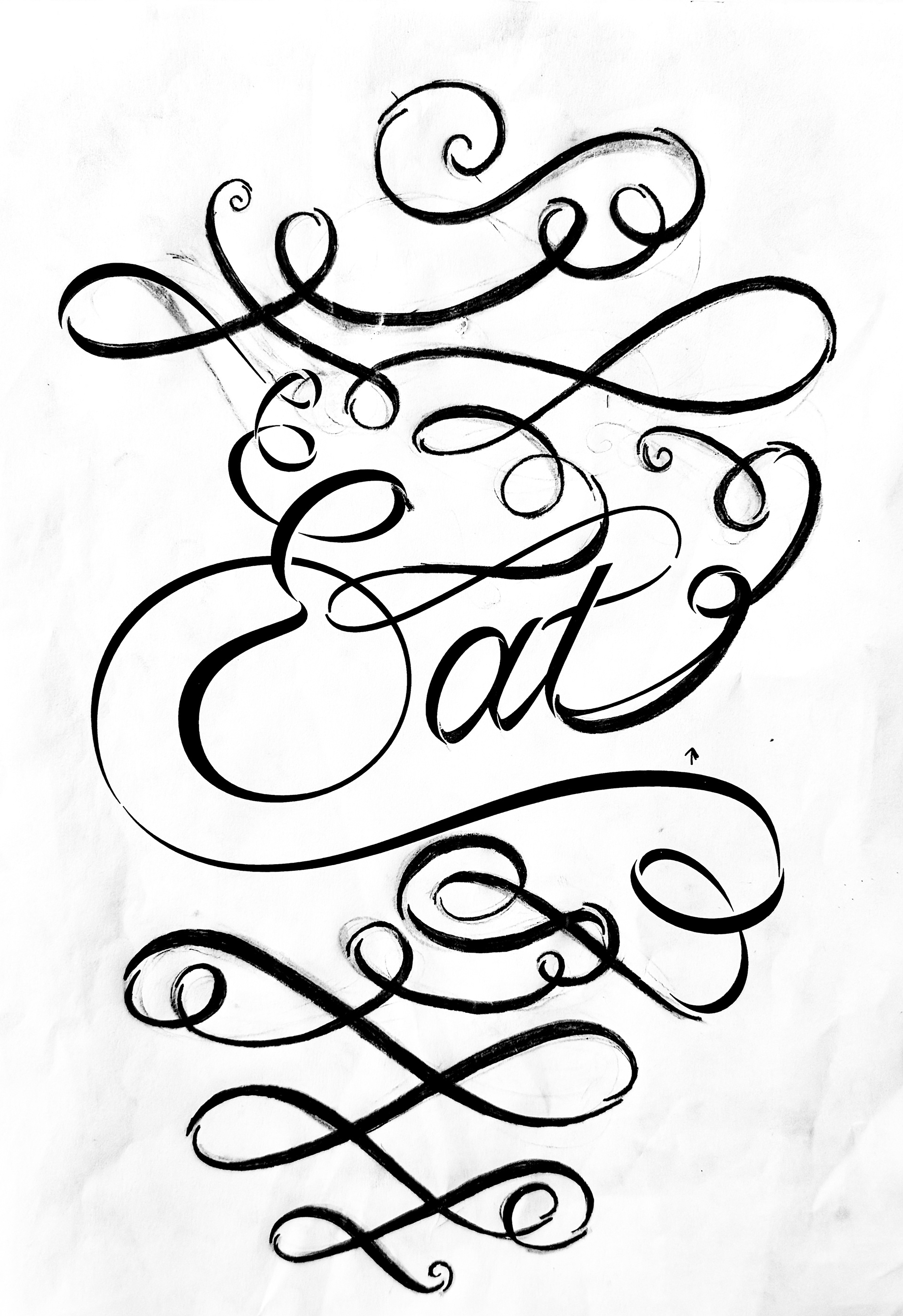
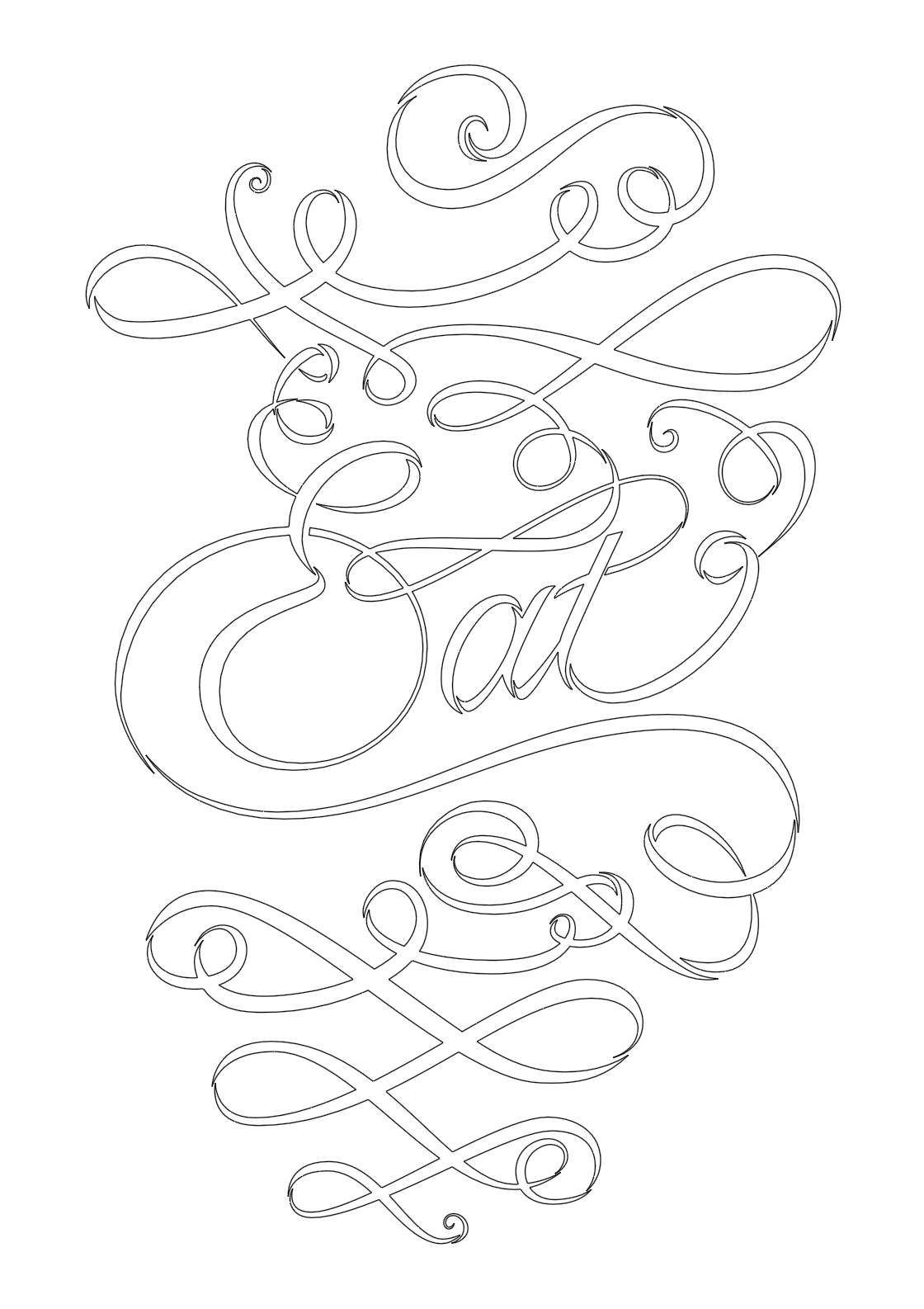
I formulated the design 'Eat' starting with just three letters and some minimal embellishments in Adobe Illustrator. I then printed the initial design on paper and began sketching a larger composition. I wanted to visualize the dynamic experience of sharing a meal: what happens before, during, and after a meal. I crafted rhythmic swirls guiding a viewer's eyes throughout.
FINAL POSTER
For the final colors I chose black and yellow. These colors are representative of the larger brand this poster is a part of.
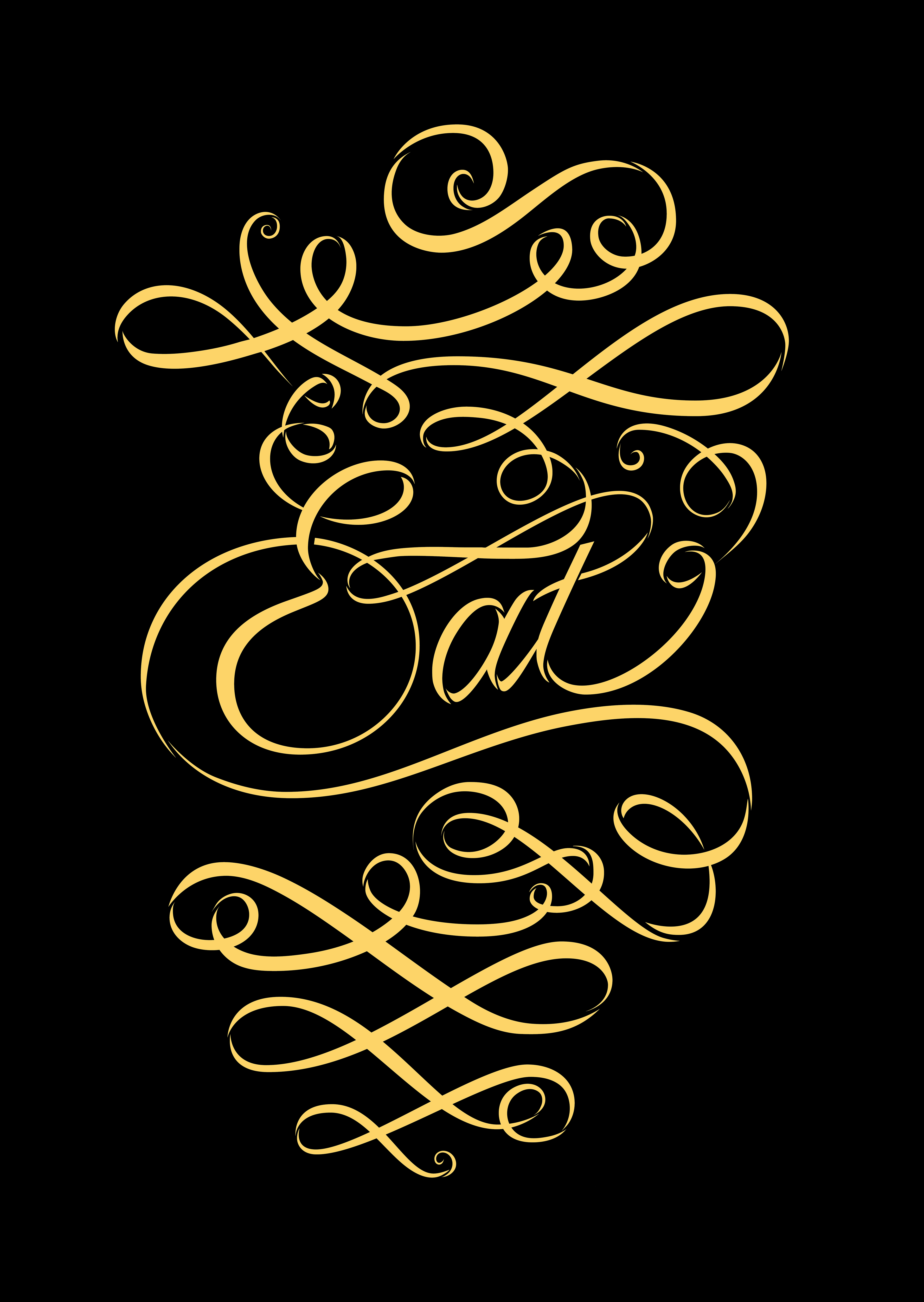
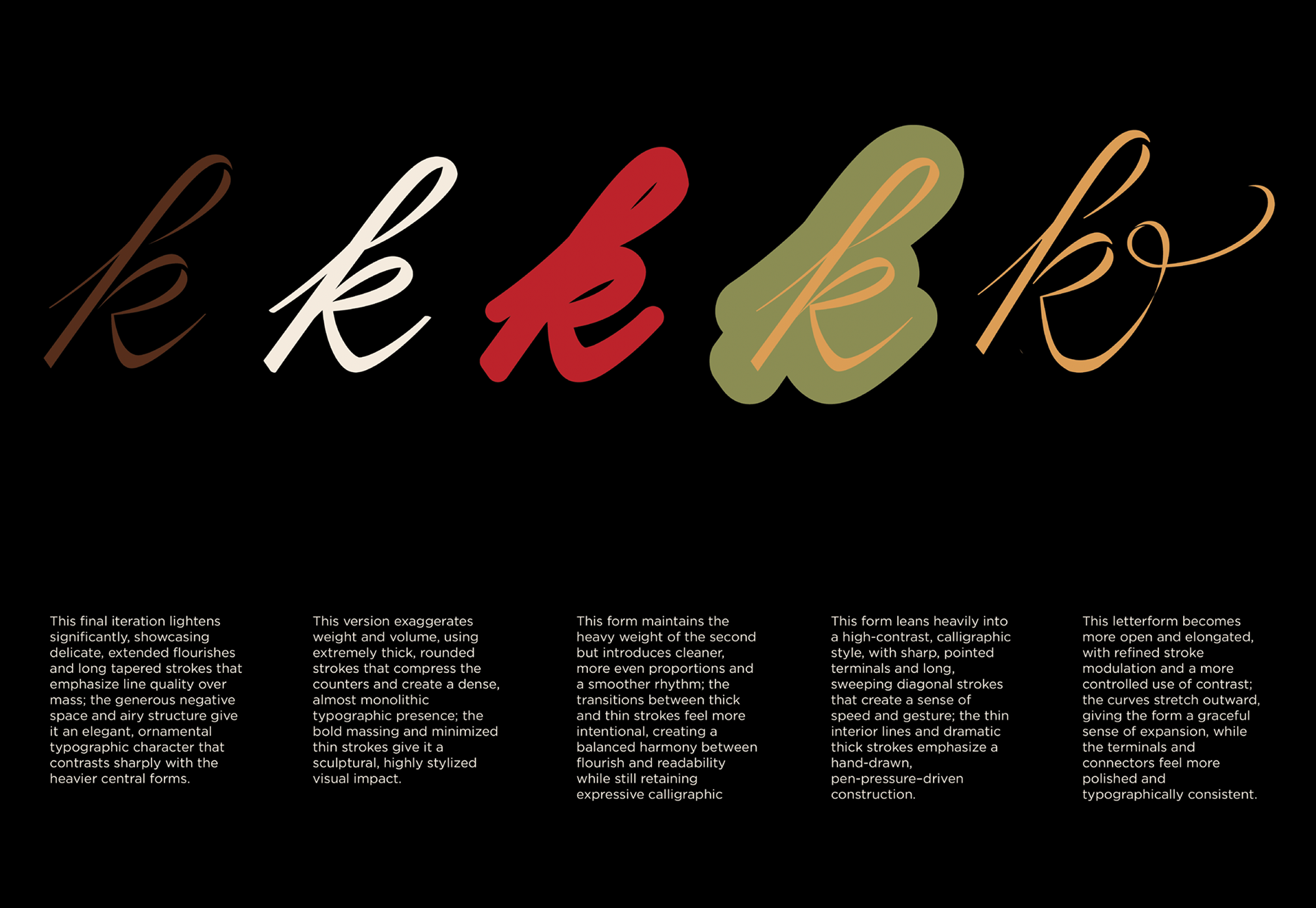
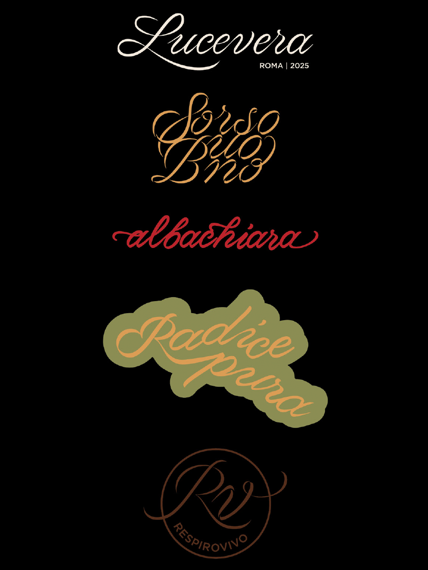
This poster is specifically for the bistro cafe Sorsobuono. The Sorsobuono logotype is modulated cursive with rhythmic, ornamental embellishments. The yellow represents the vitality within a dining space.
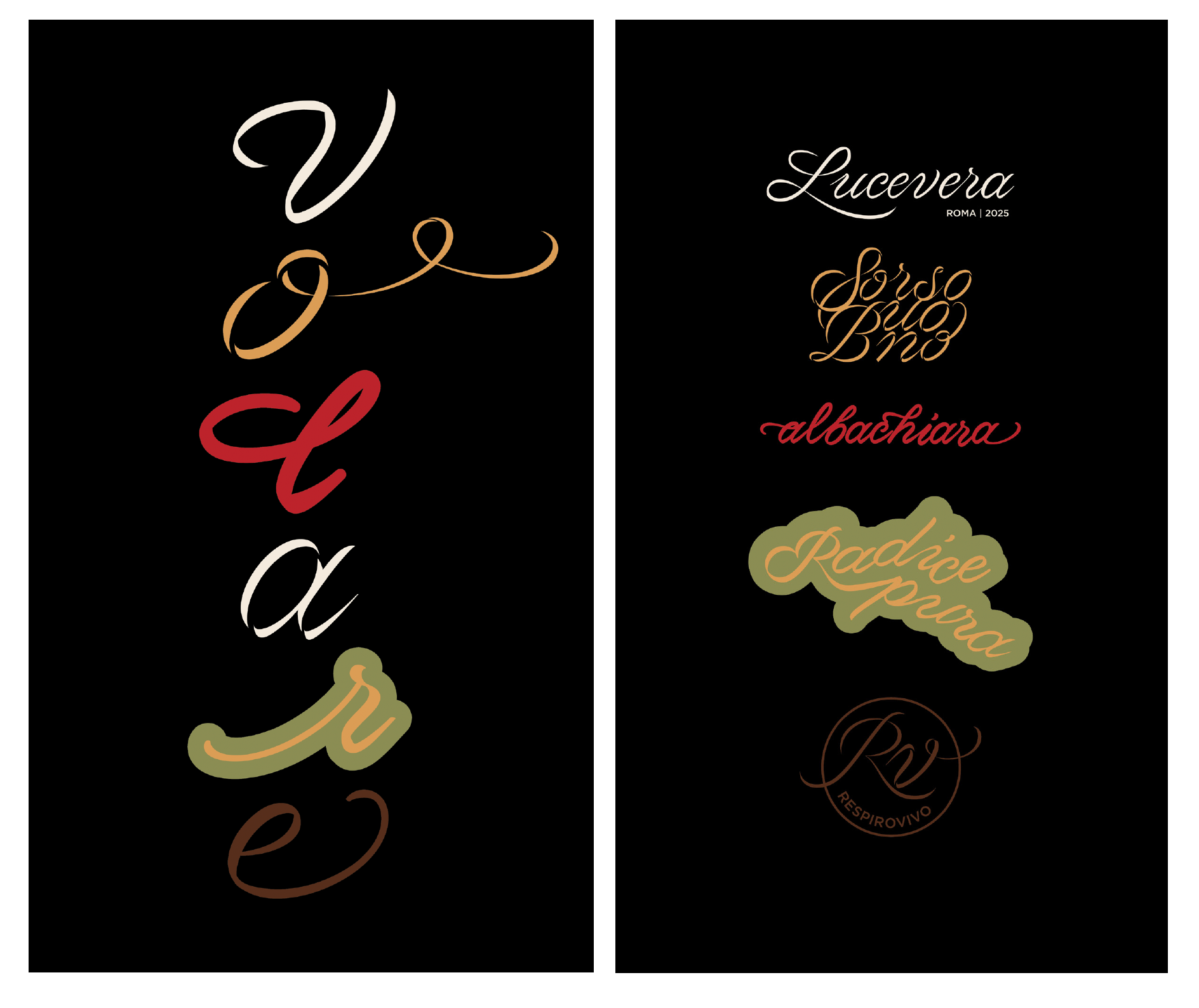
Five versions of logotype were created to define five different venues within a common space.